Accompany You Fit
Improvement of Experience in the Gym
Project Info:
- Tools: Figma
- Date of Completion: 2023.10
- Contribution: Personal Project
- Project Experience Link: Accompany You Fit
Challenge
In the gym, in addition to the guidance of professional fitness trainers, it is difficult for people to be able to obtain effective training guidance through short videos as well as text on the Internet. This phenomenon makes it impossible for people to get the expected training results and makes it easy for people to get injured. I have conducted a statistical study on people's fitness experience and willingness to work out, and found that people think that there is a demand for the use of equipment, scientific fitness programs and diet plans, but there is not a unified, scientific and affordable channel to obtain this knowledge. How can we utilize HCI strategies to help people effectively access fitness knowledge and help them exercise scientifically?
Executive Summary
Goal
Helping people to exercise effectively by improving knowledge of science-based fitness.
Solution
I developed Accompany You Fit, an interactive fitness software for solo fitness or fitness novices to help them make a sensible fitness plan and reduce the possibility of injuries during fitness.
The Users
User Interviews
After looking over the data from the screener surveys, I narrowed it down to 4 users to interview including in-person and remote. To get a better idea of what's working well and what areas need improvement in the tool to be designed, I asked them a series of questions about how they organize and stay on task.
A few of the survey questions include:
- How do you usually work out when you go to the gym, and what kind of assistance do you feel you need in terms of training when you work out?
- How did you develop your fitness program, and do you think your current program is helping you to
- Do you think the gym's facilities are good enough for your fitness program, and if not, what are you doing about it?
During the interview process, I learned that people don't want another course-filled app. They want the flexibility of an app that will meet the space constraints and facility constraints of different gyms so that people can utilize the facilities available at their current gym and satisfy their fitness expectations. They also wanted a program that would help them keep track of the intervals between sets and rest periods, which would be a useful tool for them.
Target Users
Novice users who want to work out sensibly and users who work out alone.
-
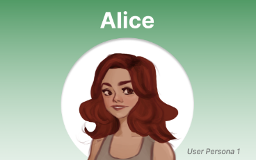
Alice
- 28yrs old, female, occupation: Doctor, financial status: budget
- go to the gym alone regularly
- Wish she had someone on hand to cue her movements and help her keep the pace when working out
-
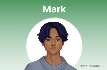
Mark
- 22yrs old, male, occupation: student, financial status: tight
- doesn't have enough budget to employ a private coach
- loves to go to the gym, but has no idea how to make a scientific workout plan
In my first round of interviews, I conducted 2 interviews with the main stakeholders to get a better understanding of their feelings towards and experiences with fitness. I
UX Research
Identifying the problem
I conducted a background study by conducting a competitive analysis with other digital negotiation tools and completed a heuristic evaluation of the Nike Training Club app. The app provide users with various courses like home workouts, mindfulness, yoga and high-intensity training. This app helps users progress towards their holistic fitness goals with tools to support their physical and mental well-being.
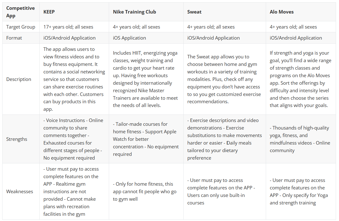
Competitive Analysis
Affinity and Empathy Mapping
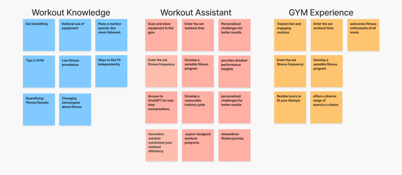
The next step was to analyze my primary research through Affinity Mapping. I looked through my notes and re-listened to the audio recordings from the user interviews to write out key ideas, quotes, and any quantitative research onto sticky notes. After laying them all out, I started categorizing them into three main themes which were organization, integration, and simplicity.
To further put myself in the user's perspective, I created empathy maps using two potential user groups which were students and creatives. During this exercise I considered what each of them would think, feel, say and do and noted the pains and gains they were having while using current tools.
Design
Ideation
To start the design stage, I used speed dating method and gathered participants' reactions to each storyboard scenario. I discovered which speed dating concepts were universally accepted and which ones were not so popular.
How might we...
- How might we... use bots to assist people workout better and more scientifically?
- How might we... provide answers tailored to the needs of the client based on their needs?
Concept Selection
-
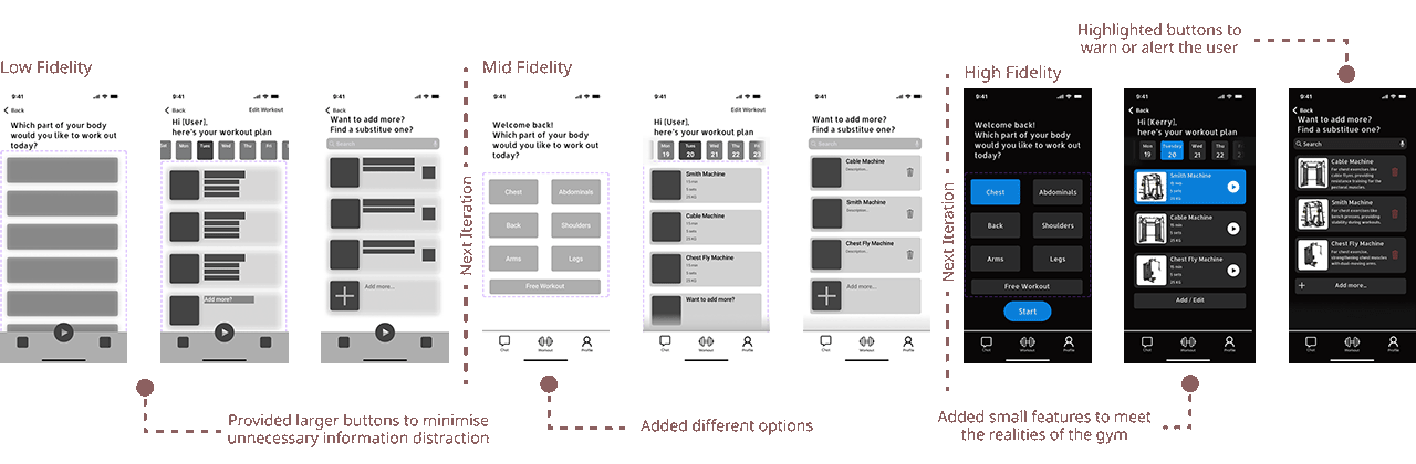
Chat robot
- A 24-hour online robot that can answer any questions about fitness, book appointments, make and change fitness plans.
-
Workout instruction
- Video demonstrations during fitness, voice prompts, users can always communicate with the robot during the process
-
Statistics
- Provides access to historical data, e.g. calories burned, time spent on each device
Why a native mobile application?
Our team believed that these 3 features could best be implemented by way of a mobile application, as people are constantly on the move in gym and need resources that are available during workouts. Additionally, we believe that a mobile app will have a larger reach than a web-based solution.
Solution
Prototyping
I used Figma to design various screens and key features of our prototype.
Usability Testing
We returned to our users for feedback. To test the efficacy and intuitiveness of our mobile toolkit, we relied on users' Think-Alouds to understand how our design concepts were received.
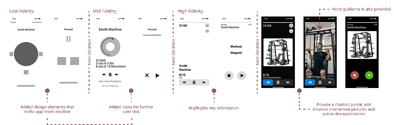
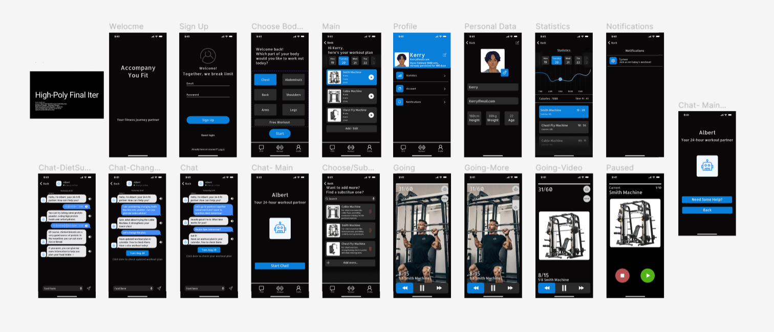
Workout instruction
Originally, I thought users might be monitoring the screen at all times to note their progress, so I zoomed in on the numeric information along with the progress information.
Also, after in-depth user research, I found that some users want to be able to stop as they go, so I added a separate play button for each workout.
Insight from Usability Testing: While users felt the video instructions were helpful they preferred if they have more ways of getting tips. I assumed the user to be able to focus on their current workout and to be able to quickly know the information rather than read the screen content in detail, while effectively minimizing false touches. That's why I allocated most of the screen space to video, and also included an eye-catching progress bar and larger buttons.
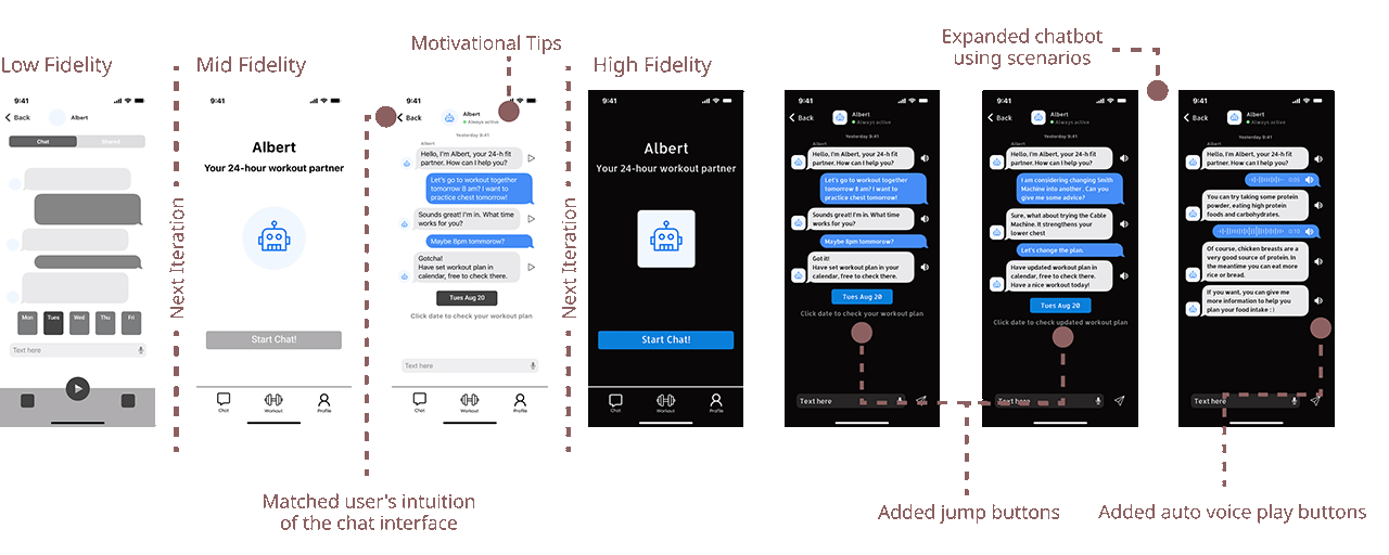
Chat robot
The dialogue page follows the user's intuition and includes buttons to jump to the fitness plan page to reduce the number of screen taps. A text-to-speech playback button has been added to help users focus on fitness.
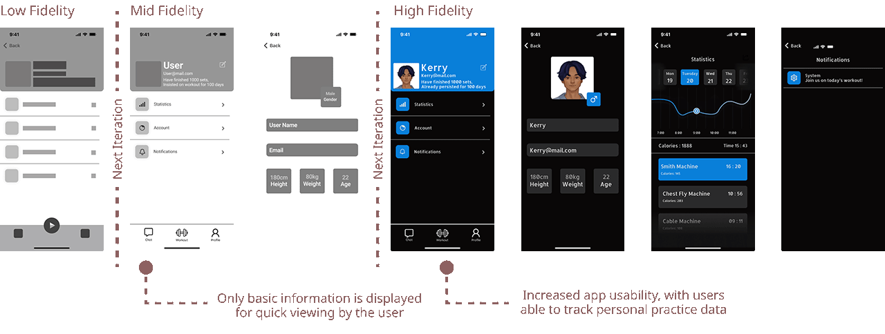
Statistics
After eliminating unnecessary information, the archive page provides users with basic information needs in three modules: personal information, data analysis, and notifications.
Final Design
Feel free to try interactive version here: Figma Link
Reflection
Multi-faceted design thinking
I enhanced my creativity and artistry, realizing that user insights play a vital role in design decisions. At the same time, I was able to put my basic knowledge of UIUX design into practice, using common design decision tools such as affinity maps.
User communication skills
I conducted several user interviews during the project, and I learnt how to be a good interviewer, throught allowing users to express their feelings as much as possible during the interviews and suggesting improvements they would like to see in the design